For online course design, we had to submit a creative product that described our project plan for the class. I decided to combine using Keynote (a Mac-based presentation software) and Animoto to create a slidecast of my plan. Check it out!
App Design Week 15: Debugging Annoyances
This week really had me frustrated with the designer interface. I designed this app with some general computer use understandings that just aren’t present in this interface and that has caused sheer frustration because of its complexity and scale. I’m used to being able to select multiple objects and put formatting on them all at once, not having to select each object one by one. As a result, I’m running into time issues because there’s so much to do.
With that said, I can’t complain too much about this interface because it truly has taught me a lot about programming. Outside of class, I have seen my skillsets with Excel and Access and SQL skyrocket — necessary things this fall with work. There’s not a direct correlation between the interface and these software programs, but the logic we’ve been learning in class is the same when applied to these software packages.
I still have a lot of work to complete on my final app before it is completed on Friday. Here’s the home stretch!
Week 13: Final Project…Blocks Editor Week
This week we continued work on our final project, using the blocks editor. For me, this was the realization that my app is extremely complicated — more complicated than I’d realized. I’m simulating LOTS of different screens switching in and out, and programming the navigation buttons alone took several hours because of all the components involved. I am striving forward, though, and will have this app done in its originally planned design.
I did get excited when I was able to complete one part of the app, using my textbook and the web to figure out how to use the list picker and urls and the activity starter. Here’s an image of that section so far:
I am running into even more frustrations with the app inventor interface — especially the blocks editor. It’s too small, and it’s clunkily formatted for scrolling and moving blocks components around. I also wish it had copy and paste or duplicate functions. That would make some of the coding easier.
With that said, I am excited to see the work of this semester coming together in all the different components of my app design. I understand so much more about logic and programming than I did before, and even if I never program another app after this semester, I’ll be able to use what I’ve learned here in web design and SQL statement writing, and maybe even tackle new programming endeavors, including Stanford’s free iOS 5 course.
Week 12: Final Project Reflection Two
 This week I began designing the app for the final project that was proposed last week. I am designing an app that will allow librarians to learn about the CREW weeding method through a brief lesson, take a quiz on the lesson, quickly access the weeding criteria for various sections of the library that are in the method, and access further resources on the web about weeding in the library. It sounds like a very complicated application, but I have every confidence that all these components will be successfully added and accessible. This could be a very powerful tool in the hands of many librarians.
Because this is a complicated app, the current display of the app is quite messy (as you can see at the right). I haven’t started using the blocks editor to “hide” various content to simulate different screens, so the app current looks like this. Also, much of the content will be called from lists within the blocks editor, so there isn’t much displaying at this time in the components editor.
I am pleased, however, at the progress it has made. The fun — and complicated — part begins this next week with the blocks editor components.
One component that I would like to add to this app, but I think is too complicated for this first design (and probably not available in the app inventor interface, anyway) is the addition of a barcode scanner AND a way to connect to a local library’s catalog to search for materials. I’ve seen this done in other library-related applications that have been released lately. That would be a nice addition to this app. Definitely would like to add this feature in the future!
Week 11 Reflection: Final Project Week One
I am excited about what I have put together in a proposal for the final project for this class. Weeding in libraries is something that is difficult to teach and get people to do; there is a great weeding manual available for free online, but it is lengthy and not always easily accessible while you are weeding in the stacks. Having a mobile app to learn about the method, and also quickly access the weeding criteria for different library sections would be quite useful. I am looking forward to bringing together lots of things we’ve learned over the course of this class to build this app. It’s going to be complicated, but will be practical and useful. If I succeed in building it, I hope to provide access to it for other librarians.
Week 10 – Presidents quiz
 This week several lightbulbs went off for me. The biggest one was when I realized that while multiple screens weren’t “available” in the app inventor interface, you could simulate different screens by making different components visible and invisible at different times. I heavily used this feature in this week’s app design.
I also discovered the wonders of calling lists. I’d been wondering how these worked since working with a very basic one several weeks ago, and last week wondered if you could call image files from it. This week showed you can! The logic behind this design interface continues to amaze me at its simplicity. I always thought programming was complicated and difficult, but in this one, at least, I’m finding it very intuitive and easy to understand. I probably have reflected on that statement before, but as someone who has done some HTML work, a bit of PHP hacking, and a bit of SQL report writing, the app inventor interface is simply the easiest “language” I’ve used yet.
I’m excited about figuring out my personal project for the rest of the semester. The possibilities are truly limitless with app designing — well as much as can be done with the app inventor interface. I discovered the hard way this week that it has uploaded file size and total app file size limitations, which limits a lot of multimedia-rich ideas.
Where’s My Car Reflection
I’ve been amazed throughout this class at how any simple concept or idea or problem can be easily designed to be helped out by an app. The no-texting-while-driving app was a great example, but this week’s app is even better and even more practical. I don’t know how many times I’ve lost my car or watched family members forget their cars

‘ locations in a parking lot. This app is quite handy to resolve that problem. (now, if only car keys could have gps chips to be used with “find your car keys” app — that would solve even more problems!)
I’ve written about this before in this design journal, but I continue to be frustrated by the lack of control on the design interface. I’ve figured out I can somewhat control the margins of the label displays by placing them in a horizontal arrangement and then adding another one that is 10×10 pixels inside to give a “fake” margin to the element. Even so, I wish there was more control over the display locations. It’s the web designer in me, wanting much more control!
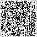
Scan the QR code to download this weeks’ design app.
Week 8: Kansas City Tour App
This app was honestly fairly simple to create, once the concepts were understood. It was exciting to see how simple it is to create a “list” that users can choose from and then, using the activity starter code (if you have it for different apps), launch an external app to load the content. I can see this being used in all sorts of ways for educational and informative purposes, including videos, maps, links, etc. I enjoyed working with maps of Kansas City sites. This was an interesting app to build, as I could see students using this platform to design a quick country tour app, instead of a country written report.
Scan the QR code to download and install the app.
App Photo Credit (Creative Commons license).


Week 7: Ladybug Chase
Reflection
I discovered the importance of not fully trusting the Blocks Editor interface testing through the phone on this app. There was a problem with the image file name I was calling during the GameOver step. It turns out that the Blocks Editor device connection testing is not case-sensitive, but when a app is downloaded to your phone, it is case-sensitive. I’d been trying to call dead_ladybug.png, but had uploaded dead_ladybug.PNG to the app. When the app tried to call dead_ladybug.png, it couldn’t find the image and the app crashed! It took some troubleshooting and some backtracking, as I’d built the entire app up until this point, but I finally isolated the problem and fixed it. I didn’t customize the app’s idea like some classmates, but I did have fun figuring out all the additional places I had to add code, to add the game status, and make the buttons cooperate during their function time.
Download the App by scanning this QR Code:

No Texting App Reflection
This week’s app was basically puzzle pieces to put together, following the book’s instructions. I’m beginning to understand some of the logic behind the different options and blocks, something I never have before in previous programming exposure. I know I’ve written about this before in reflections, but it is interesting how a different approach teaching to programming languages might bring in more people to design apps. Or, maybe it’s the simplicity of the app design process, that it’s not as complicated as prior programming languages/platforms have been?
Needless to say, this was an interesting app to design, considering what it can do and keep people from responding to text messages immediately. I found the story in the textbook intriguing, and that’s something that’s great about programming when it’s done for exploration, education and edification — not profit — that a simple idea can be built upon by others and be used in so many different ways.
